
click title to go home
Stuff my design is inspired by:
The Designers Republic
70s reel to reel tape boxes
this one dictionary in particular
old Sony packaging
00s gaming and japanese fashion mags
eBoy and Nitrome
60s-80s computer design and ads
street & hazard signs & labels
Massimo Vignelli
Richard Danne
Rafal Rozendaal and Reinier Feijen
frog design
─┐
Stuff that happens to have
similar vibes to my site:
a Dymo labeller ad
Tarantino film openings
Shin Godzilla Resurgence posters
The Orange Box site
Killer 7
Persona games
Ocean's Eleven posters
Colin McRae Rally 04
─┐
my mindset
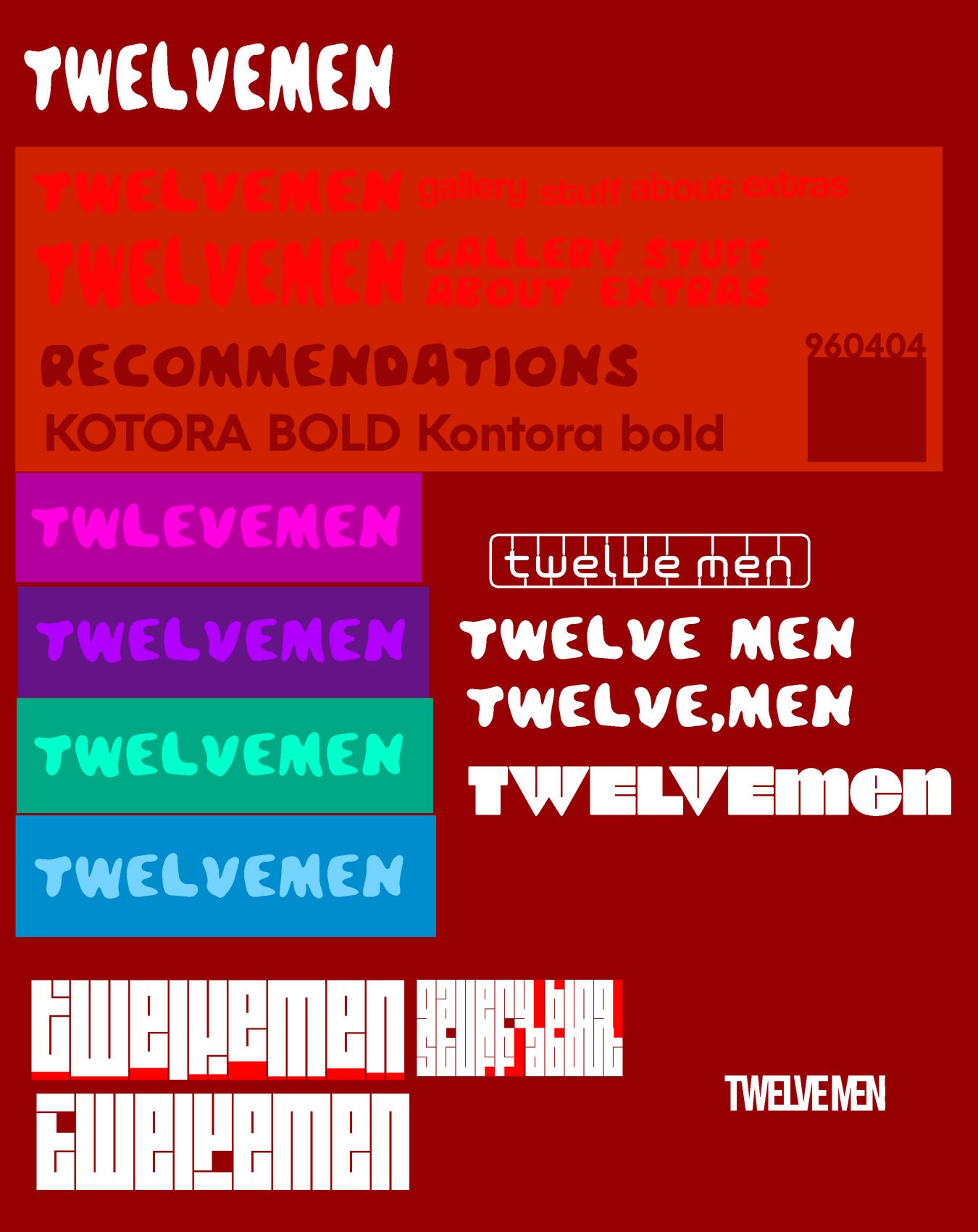
Some style practice with various fonts by the same people that made Bebas Neue. Some nice looking stuff here but nothing that I feel could functionally replace my Red II design |
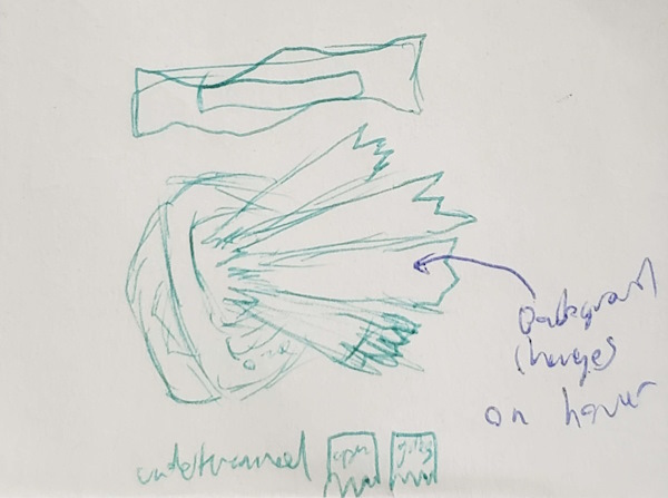
Sticky note from work where I doodled a new home page design |



Old header prototypes for the updates page. I still like the "ripped paper" frosted glass effect one, but I liked the geometric one better |
|
|
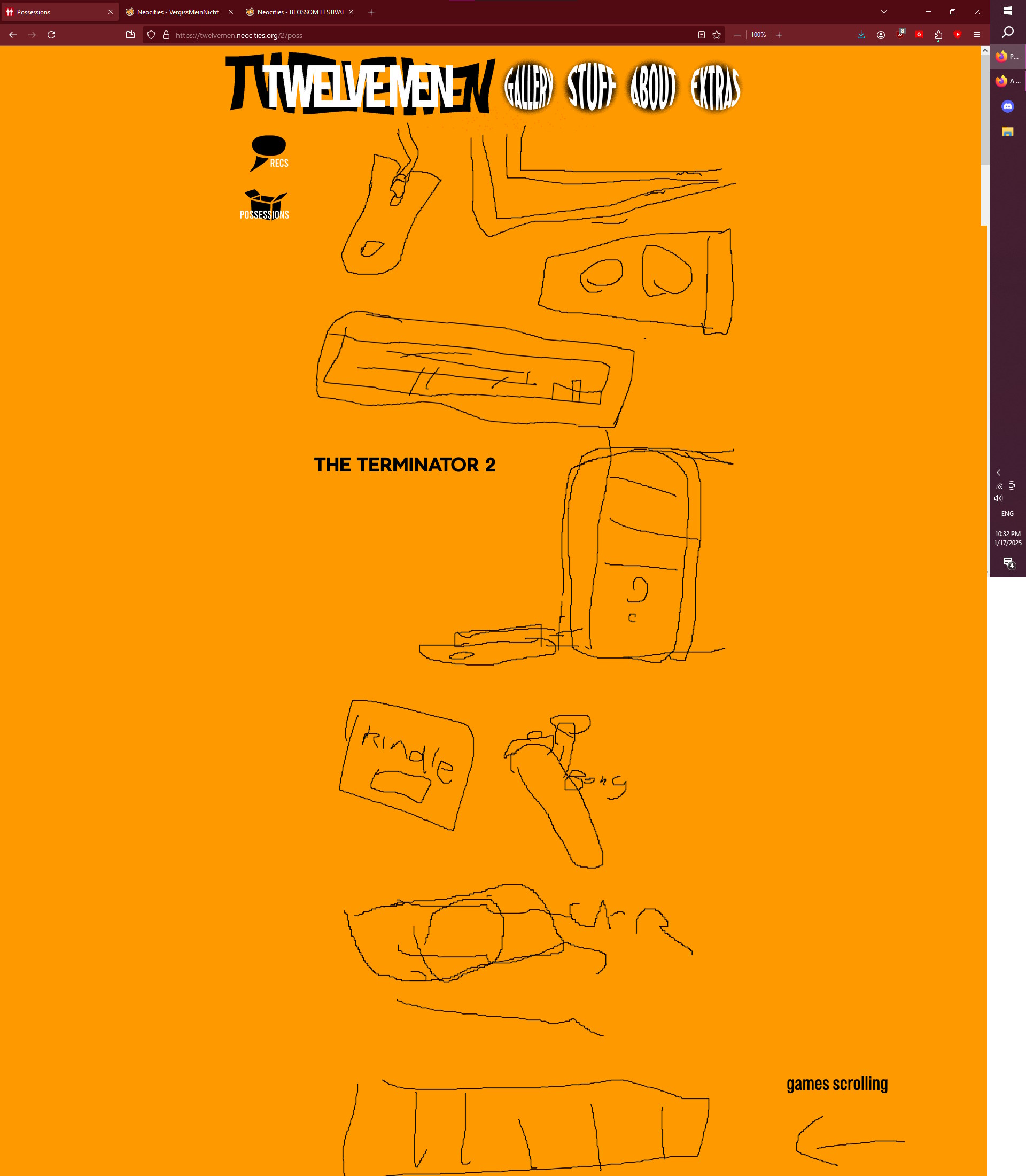
Digital mockup for recc. page redesign |

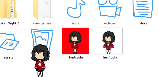
Early renditions while making the art for the men-tan desktop buddy (along with earlier version of my icon pack) |
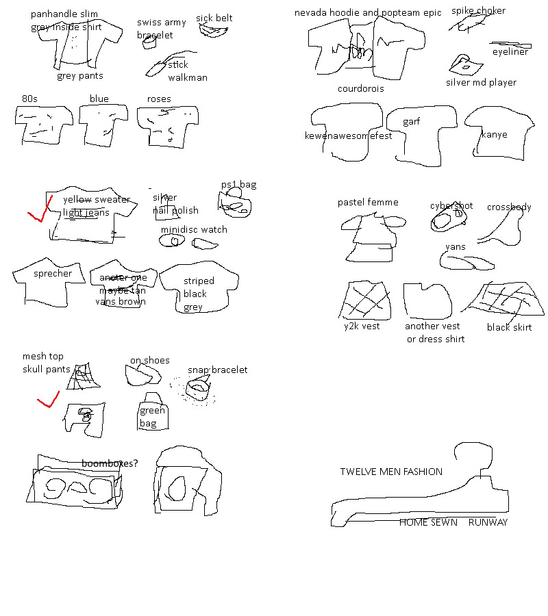
paint.net mockup of a fashion page redesign so I remember what I'm doing when arranging it |

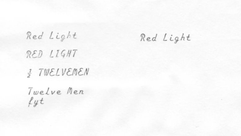

The original logo I almost used, and the typewriter text scanned in that was digitally edited into the red light logo |
Fun Fact: i have never used a vector!
Twelve Men is entirely comprised of raster artwork
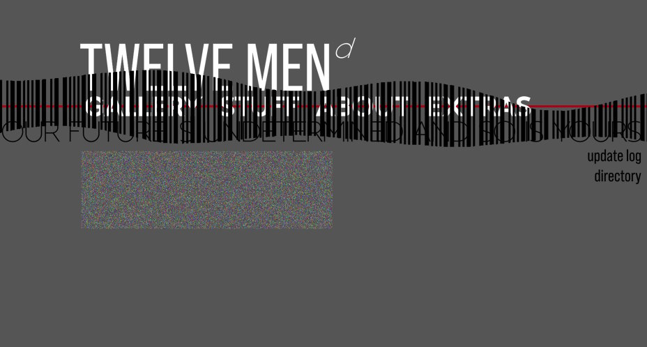
Home page concept based on the redesign Dariabot made. Thinking abt ways to make the barcode animated too |
|
Some doodles for the random chance homepage logos, top one is actually used |
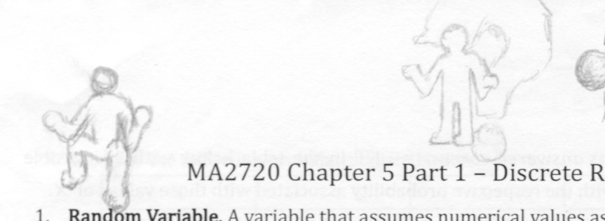
Some funky simplistic men based off the secondary logo. Never had something to use em for though. |
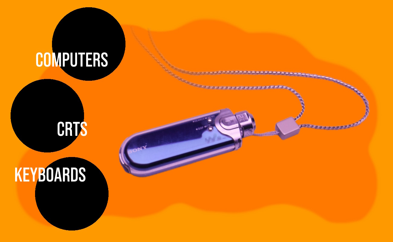
Asset mock-up that's actually pretty close to the final one |
|
Character sheet for men-tan along with art that was later digitized |
Fun Fact:
i've never had a grand plan for the site
kinda just add whatever
(maybe this parallels real life?)
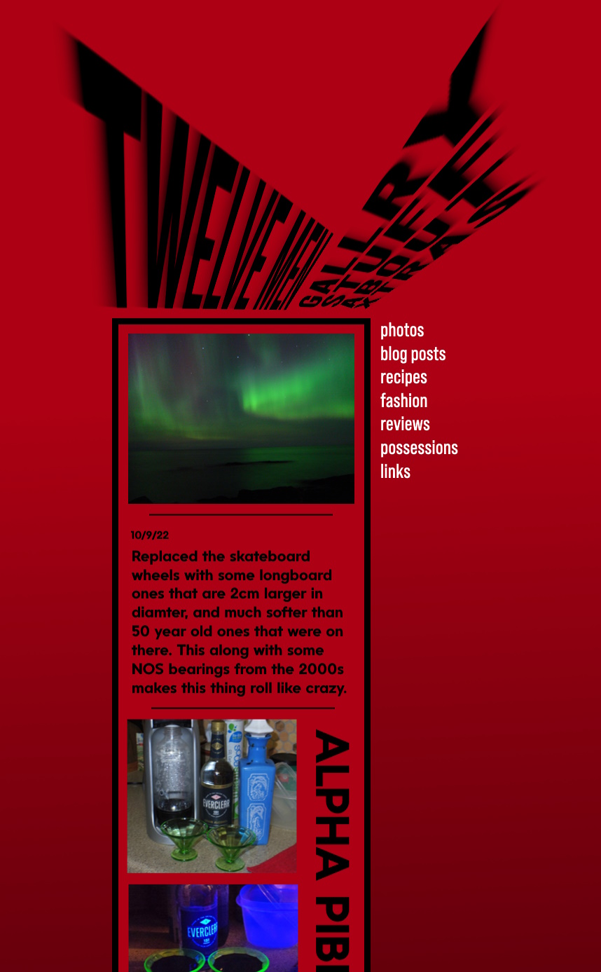
Concept for an infinite-scroll homepage as it'd be cool to have the main focus be a blog, never could think of a way to impliment it that's better than what we got rn tho |
|
Concept for a scrolling 45° update log, which I made code for but never used, along with a simple concept for the compatability chart on the extras page |
|
Sketch for the halloween logo |
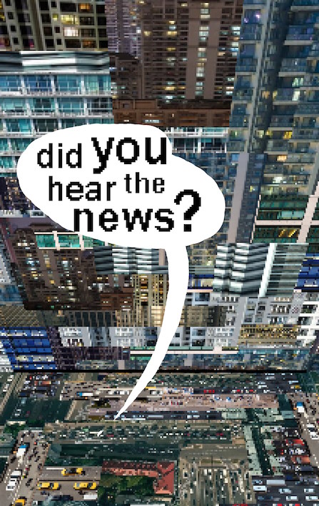
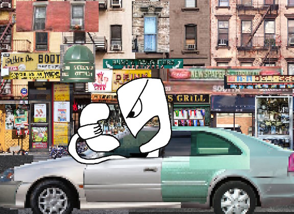
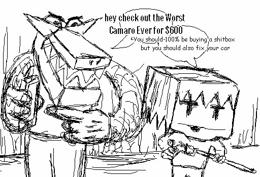
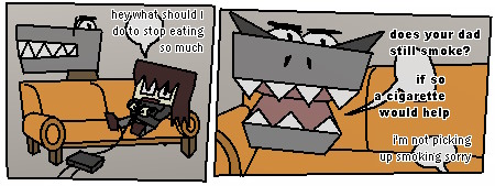
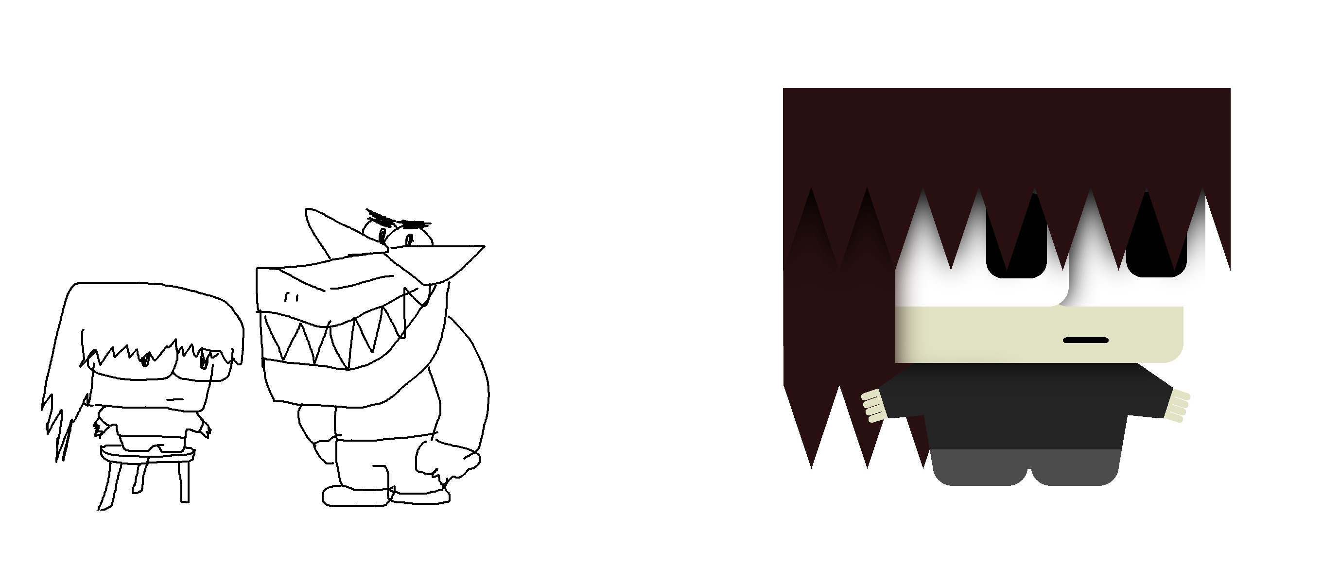
Comic art ideas but neither me nor my friend could think of any good plots |
|
Card designs used briefly on the possessions page |
|
Photo for the home page. Taken on the roof of my rx7 because it was quicker than setting up a table in the sunlight |
|
From when I was moving everything over to the RED II update |
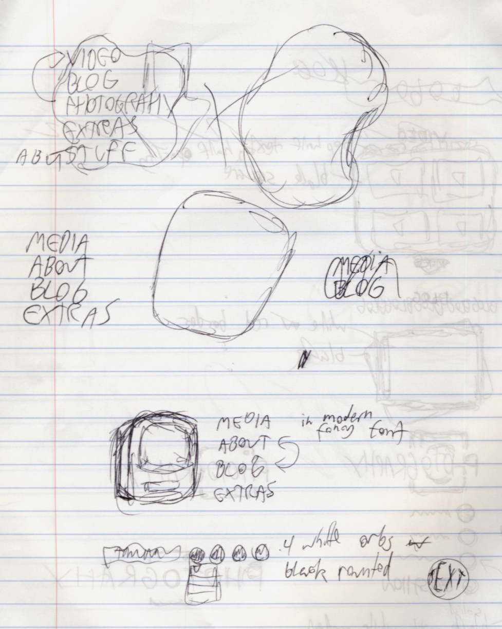
Original mockup for the RED II home page |
Fun Fact: twelve men is organic
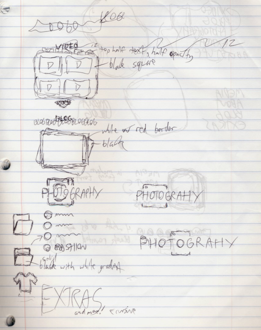
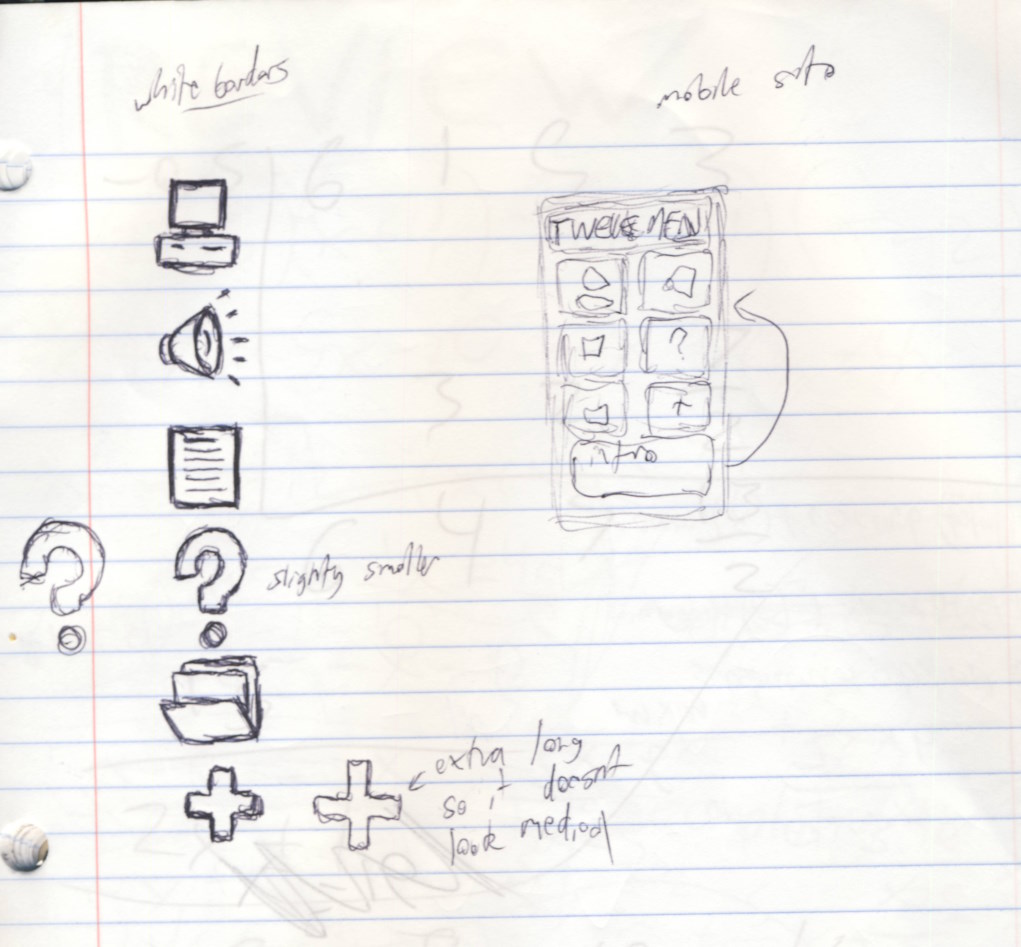
Twelve Men Moblie concepts, or at least a centralized page that holds everything |
|
Old logo idea from when I was brainstorming a Twelve Men 3 |
|
Some basic character designs from when I was thinking about making a more in-depth VN |
|
Concepts for a face logo, I tried and failed to incorperate the number "12" into the shapes |
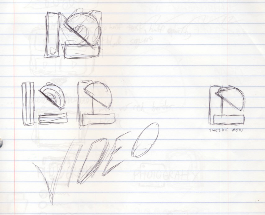
A logo animation that I was thinking about using for video intros. Never made anything that rlly fit the vibe though |
|
Navbar ideas, I still really wanna use that last one with a white background with each slice being a color from yellow to orange to brown |
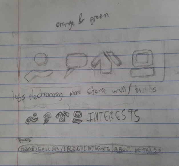
Original "two segment" designs for the stuff page icons back when it was still the interests page. This actually predates the icons on the gallery page |
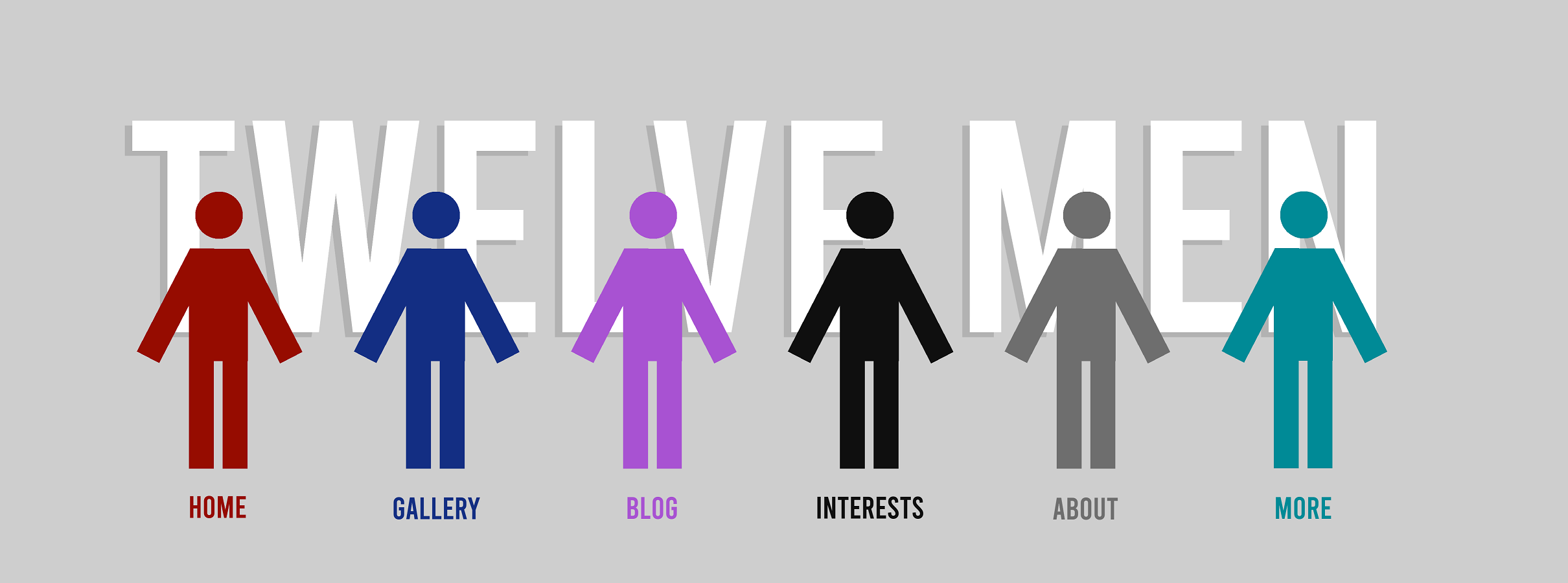
Mockup for the directory featuring the old page colors |

Navbar I tried out with matching red-chrome buttons. It was so unfitting I got rid of it immediately |
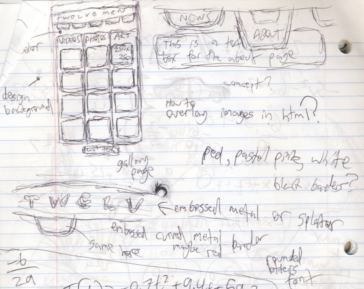
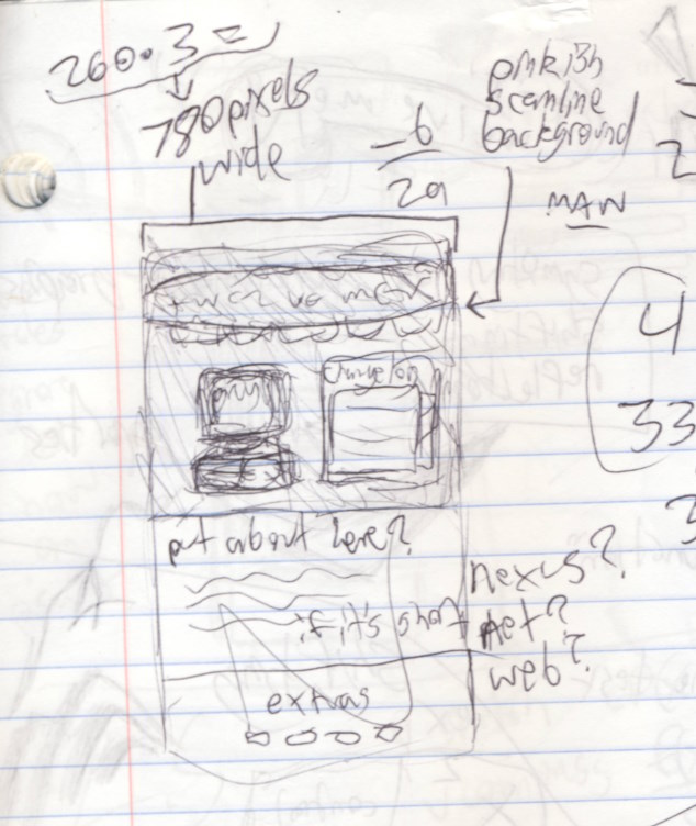

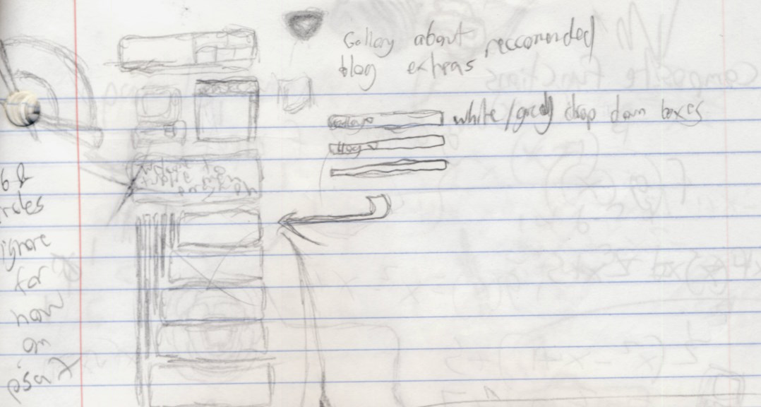

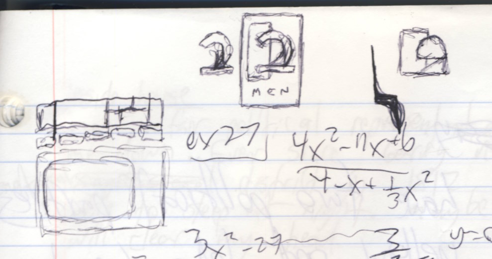
Bored sketches from a second old math notebook, which shows that a lot of my medium is happenstace from what I have available at the time |
Fun Fact: twelve men was considered a seperate
entity or "persona" until the events of April 2024
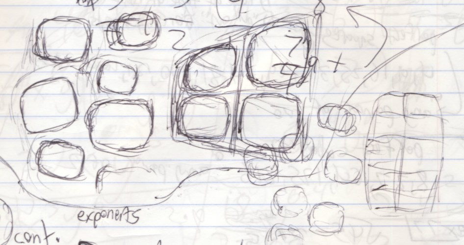
Clip for a promo short I never made |
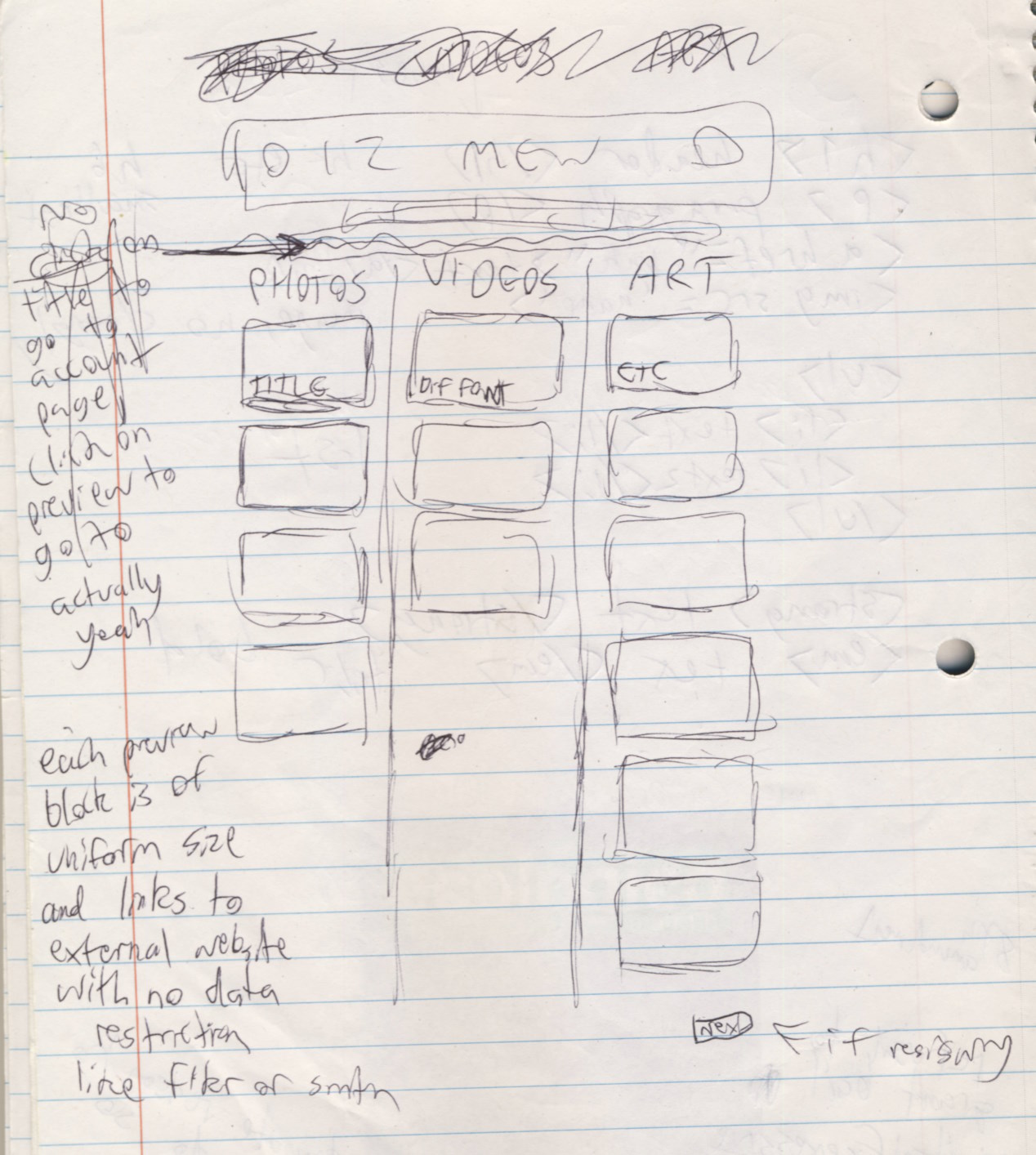
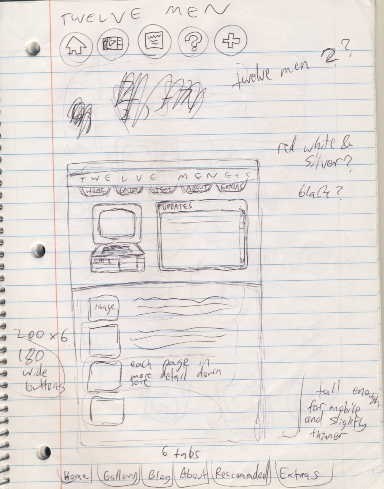
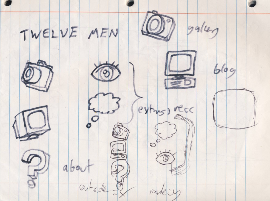
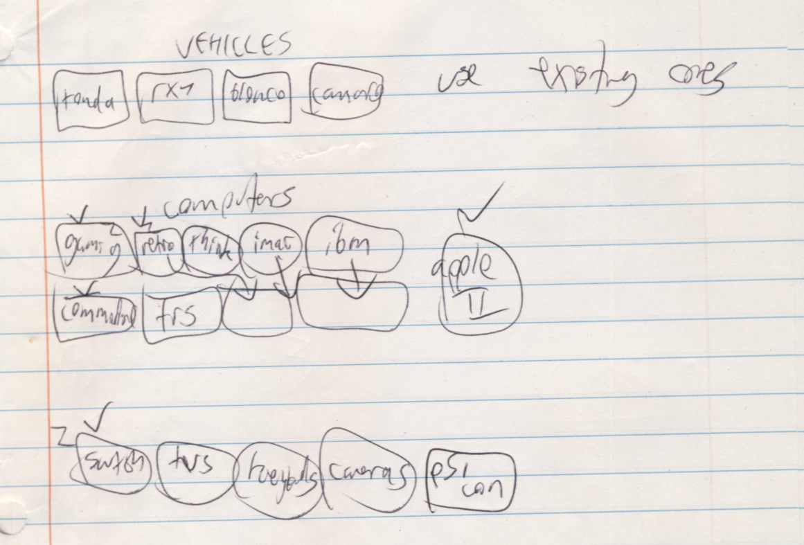
Bored sketches from an old math notebook, reminds me of when I had enough time to kill that I could be doing this in class |

Original html mockup of the old nav bar |
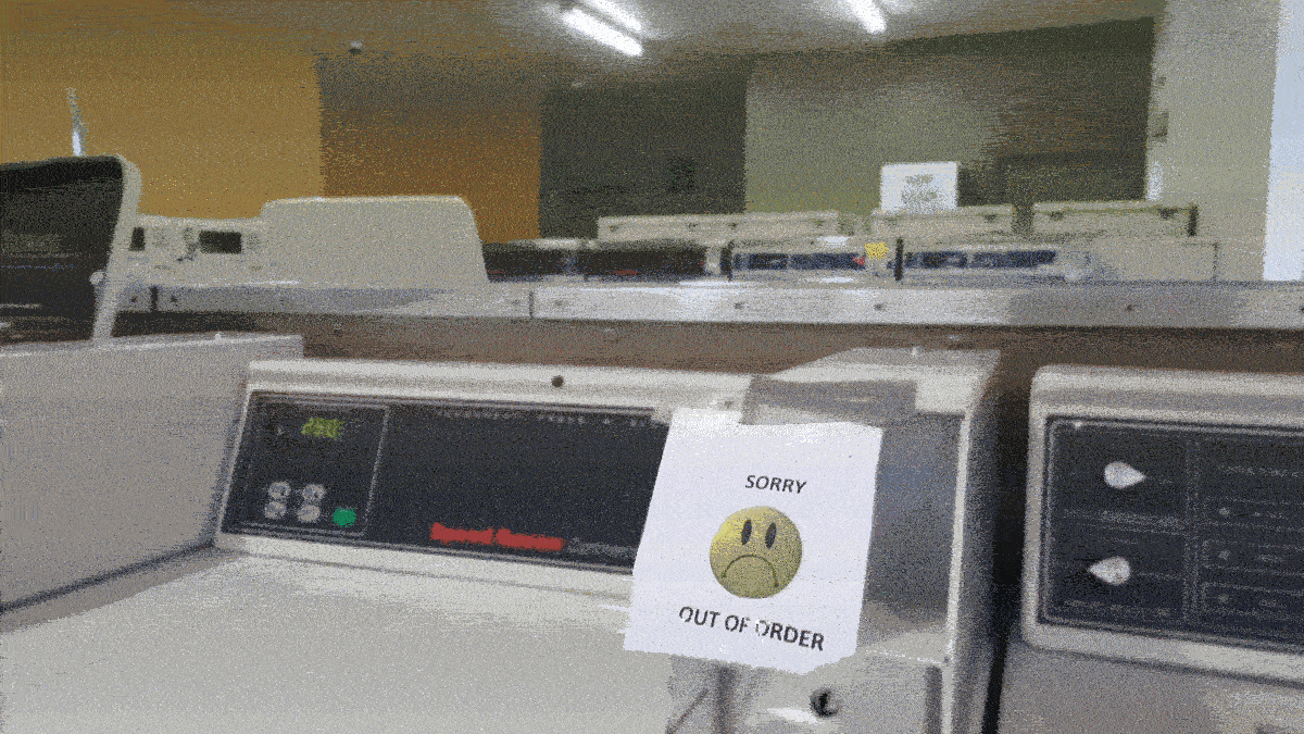
Image from one of the first 404 pages, taken at a local laundromat and heavily gif compressed |

The original Twelve Men button |
More recent stuff is posted closer to the top
